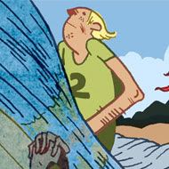
Good ol' Capt. Nemo (Twenty Thousand Leagues Under the Sea) and his crazy adventures. As I was doin this, I had this design for a skateboard in my mind, so thats the reason for the narrow vert composition.
yo youngin you need to know your roll on dem skate decks homie lol the illustration is good but yo if you need a deck temp;let holla at ya boi. nice stuff man
the line quality, gesture and movement are just awesome. I like how the colors work so well with the ink lines. the textures are also just right. I stared at this piece for a while. nice job.


9 comments:
damn this is cool
those colors are outta this world, and a very cool concept.
Holy shit!!!!!!!!!!!!!!!!!!! You are the master.
WOW!!! I love these illustrations!! The giant octopi is beautiful!!
WOW!! These are super COOL and wicked!
nice work man...
yo youngin you need to know your roll on dem skate decks homie lol the illustration is good but yo if you need a deck temp;let holla at ya boi. nice stuff man
the line quality, gesture and movement are just awesome. I like how the colors work so well with the ink lines. the textures are also just right. I stared at this piece for a while. nice job.
I want this on my next board
Post a Comment